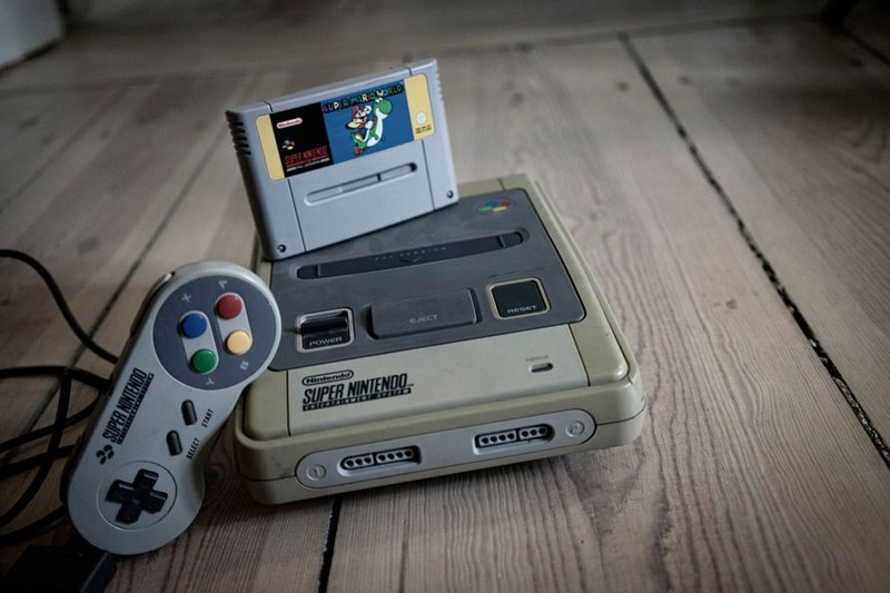
How Strider Pushed Genesis Parallax Scrolling Limits
A look at the layered backgrounds in Strider and how Capcom's Genesis port handled scrolling depth differently from its arcade source.
A Cairo-based archive breaking down NES and Sega Genesis visuals, tile by tile, palette by palette, sprite by sprite.
Browse ArchiveWe break down the tricks, tile limits, and palette hacks that built the golden era's best-looking games.
The piece on Genesis dithering techniques actually explained why Sonic's water looked the way it did. I've been playing these games for twenty years and never understood the trick until now.
Finally a blog that talks about NES tile limitations without dumbing it down. The breakdown of Kirby's Adventure's color tricks on Game Boy adjacent hardware was genuinely sharp writing.
I sent the Phantasy Star II sprite article to three friends the same day it went up. Nobody else is covering this angle on 16-bit art with this much detail.
These two systems represent contrasting approaches to hardware-constrained art direction. NES worked within a tighter palette and tile system, while Genesis pushed dithering and color tricks. Comparing them reveals how limitations shape creativity.
Occasionally, when a comparison sheds light on our core focus. Our primary lens stays on NES and Genesis, but cross-era references help explain broader trends in 8-bit and 16-bit design philosophy.
Both. We break down specific techniques like sprite flickering, palette swaps, and background scrolling, but we also write broader retrospectives on why certain art styles still hold up visually today.
Nightmare FX is a small, fan-driven editorial project based in Cairo, Egypt. Contributors include pixel artists, longtime collectors, and writers who grew up with these consoles.
Yes, reader suggestions shape a good portion of our coverage. We especially welcome pitches for underrepresented titles that don't usually get written about outside dedicated communities.
We examine sprites and backgrounds at the pixel level, showing exactly how artists worked around hardware constraints.
Articles explain the actual hardware limitations behind design choices, not just surface-level nostalgia commentary.
Written from a regional angle that often gets overlooked in English-language retro coverage dominated by US and Japanese outlets.
Reader suggestions and forum discussions regularly shape which games and techniques we choose to dig into next.
Recent dissections and retrospectives from the archive
A look at the layered backgrounds in Strider and how Capcom's Genesis port handled scrolling depth differently from its arcade source.
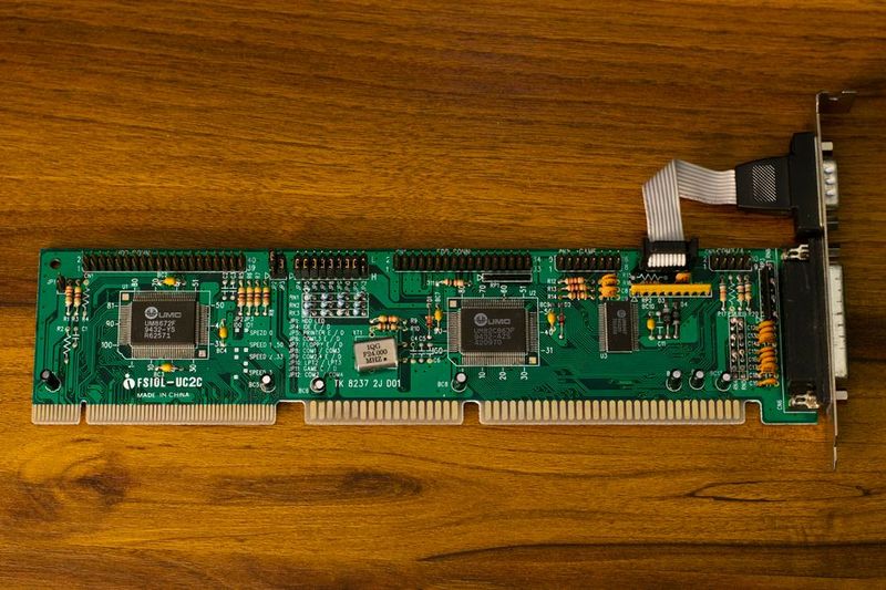
Breaking down how developers squeezed vivid, distinct colors out of the NES's restrictive palette system across several late-era titles.
Revisiting the deliberately off-kilter character sprites and how they reinforced the game's uneasy suburban tone throughout.

A practical breakdown of the checkerboard dithering technique Genesis developers relied on to simulate transparency and depth.
Covering how collectors and archivists are documenting original box art and label designs before they fade entirely from circulation.
A rotating look at the games shaping our pixel art coverage
Notable for pushing NES sprite animation further than most contemporaries, with fluid multi-frame character movement rarely seen on the platform.
An early Genesis RPG whose portrait art and battle backgrounds show an ambitious use of the console's expanded color range.
An underrated Genesis platformer whose transformation sprites reveal clever tile-reuse tricks that kept memory usage surprisingly low.
A late, rare NES release praised for detailed character sprites achieved despite the console nearing the end of its commercial life.
Its tactical battle sprites remain a reference point for how Genesis handled small-scale character animation across large rosters.
Frequently cited for its atmospheric use of limited NES color palettes to build tension through shadow and silhouette work.